Context
Fedi is an all in one social bitcoin app. It has messaging, apps, a bitcoin wallet, and a focus on community custody.
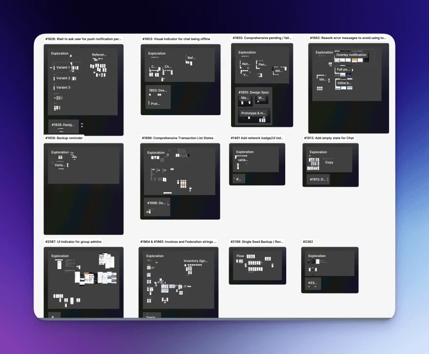
As with most startups, the lead designer was time-constrained and needed some help shipping features and quality of life upgrades. We agreed upon a backlog of projects that were loosely scoped, and were optimizing for speed.
Over a period of 2 months, the goal was to have design specs for a good number of feature upgrades and papercut-fixes in the backlog for whichever engineer had extra bandwidth. For this reason, it was important to have clear design specs and a clear line of thinking.
Here’s one example of a project:
Dynamic Strings
Challenge
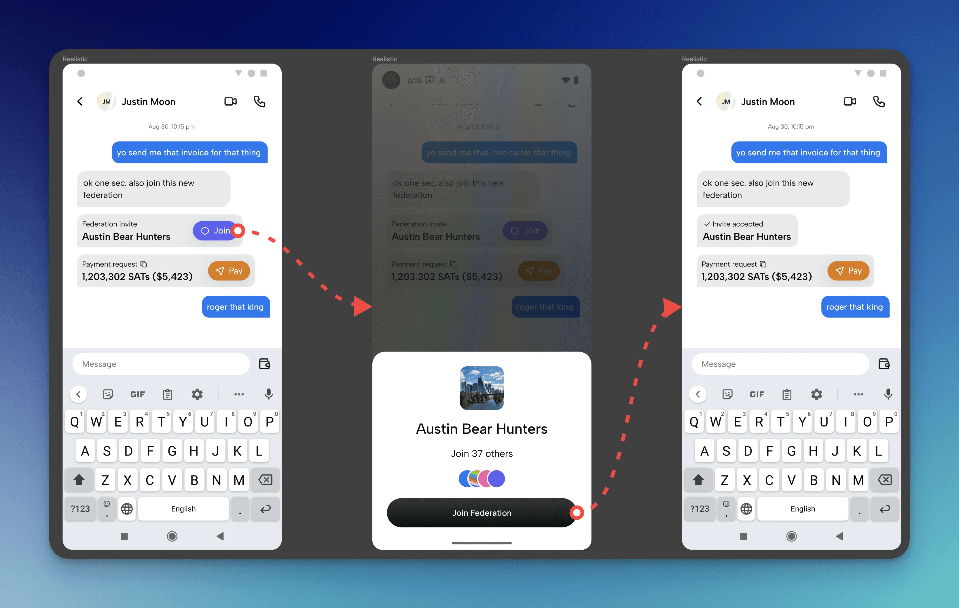
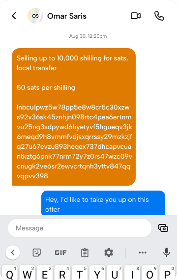
In an all-in-one community app like Fedi, members are often sending strings of data to each other that prompt an action to be taken. Examples of these strings can be payment requests, Federation invite codes, group message invites, and more. When these codes are shared in a message, they can quickly become unwieldy and difficult to take action on. Copying a large string that’s placed in between other text is a pain. Messages with a large payment request take up valuable screen real estate, and just look ugly.
The goal here was to build an interface that translated clunky strings into native-feeling, actionable messages.
Discovery
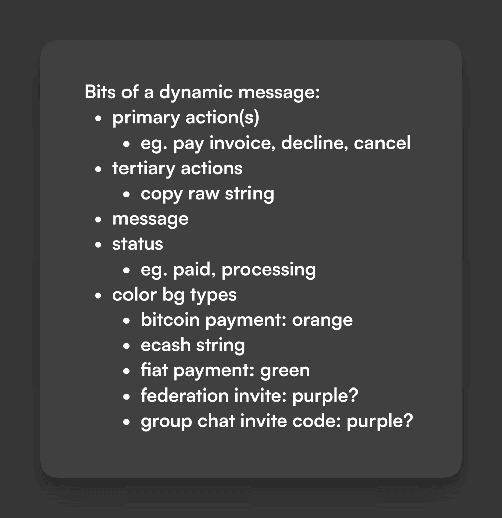
Bits
My first step was to make a list of all the bits that would make up this Dynamic String experience. This is a useful exercise before putting pen to paper, since it lets me get a birds eye view of all the moving parts of an interface (before jumping in the weeds of placement).
Market research & inspiration
I wanted to see how other applications handled this challenge. Apple’s iMessage has a similar function, as seen below.

Exploration
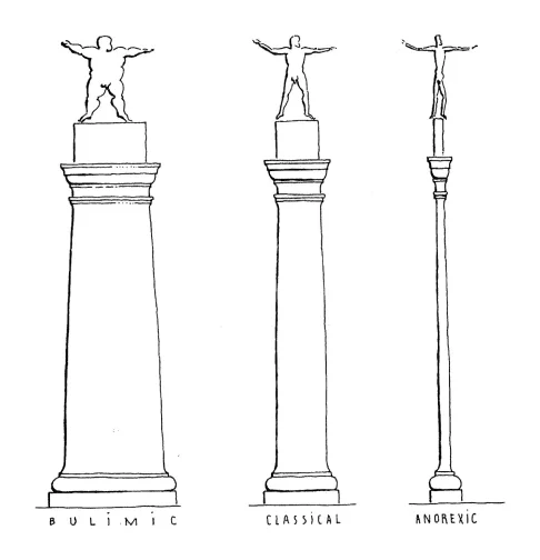
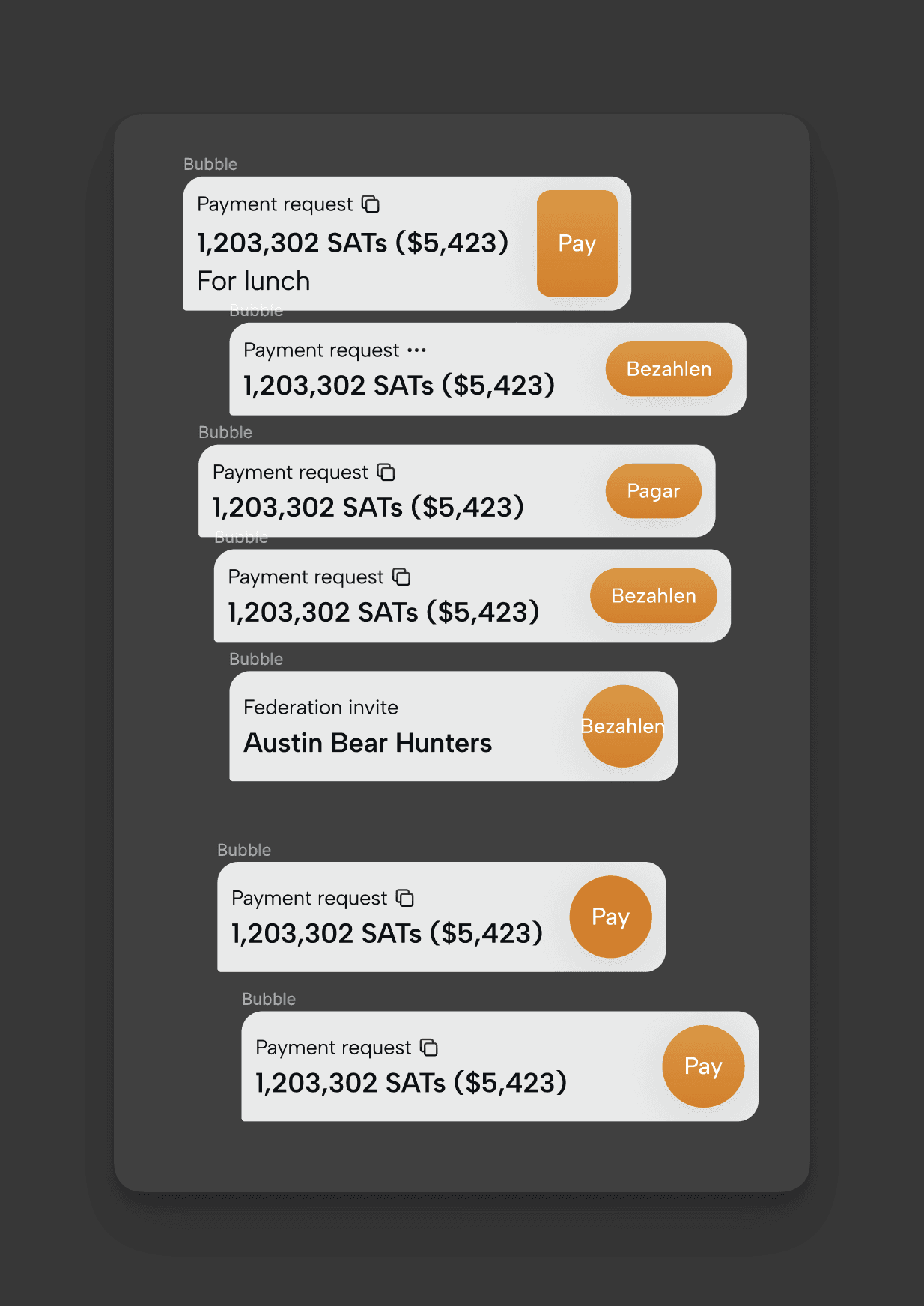
Here, I began trying a bunch of different visual representations of the Dynamic Message, pulling levers like background color, size, action style, and more. (s/o to Skyler for the analogy)
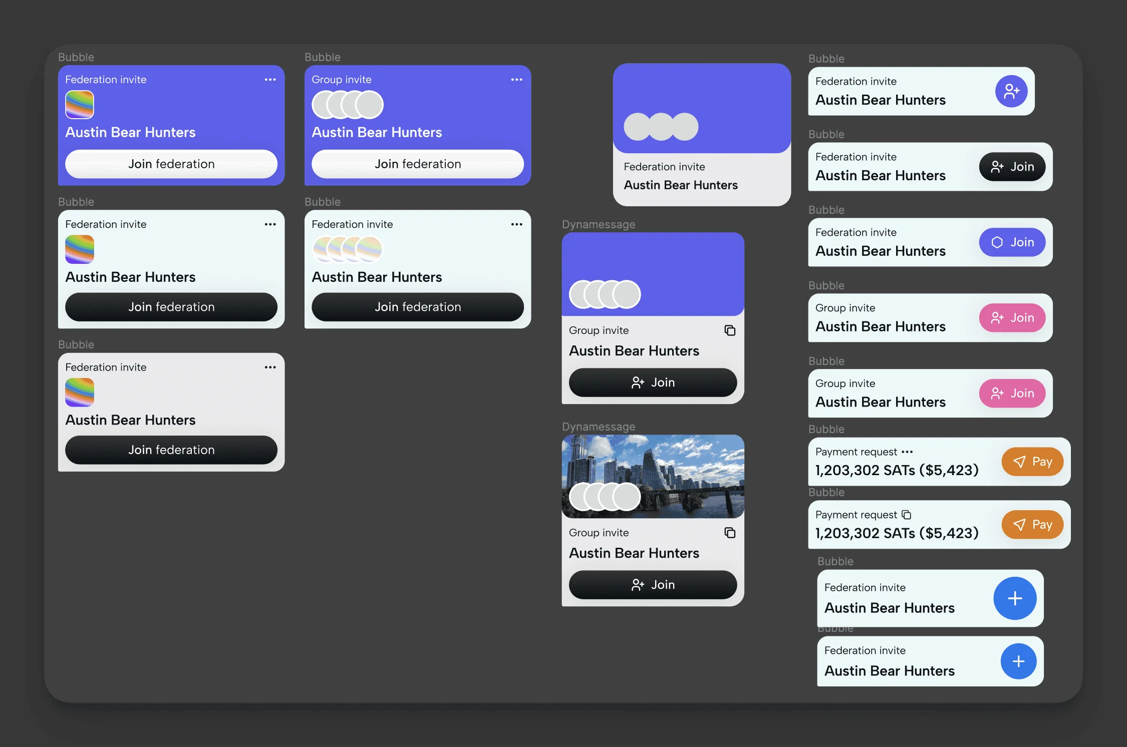
To come to a decision, we landed on two principles:
1. Let the content shine
2. Internationalization (Fedi is a global product)
Principle #1 helped to rule out the options that used more louder or branded backgrounds. It also helped reinforce that Dynamic Messages should be compact, and grow horizontally (width), rather than grow vertically (height).
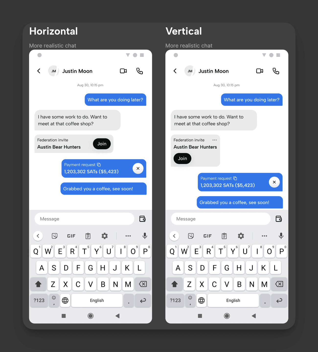
Principle #2 quickly helped to decide on a styling for action buttons. They had to be able to handle potentially larger international words.
Design spec
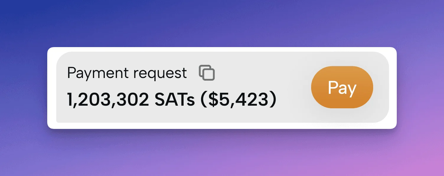
I found that the status of the string was best represented as an eyebrow on top. This also allowed for a quick action, if any (for example, copying the raw string).
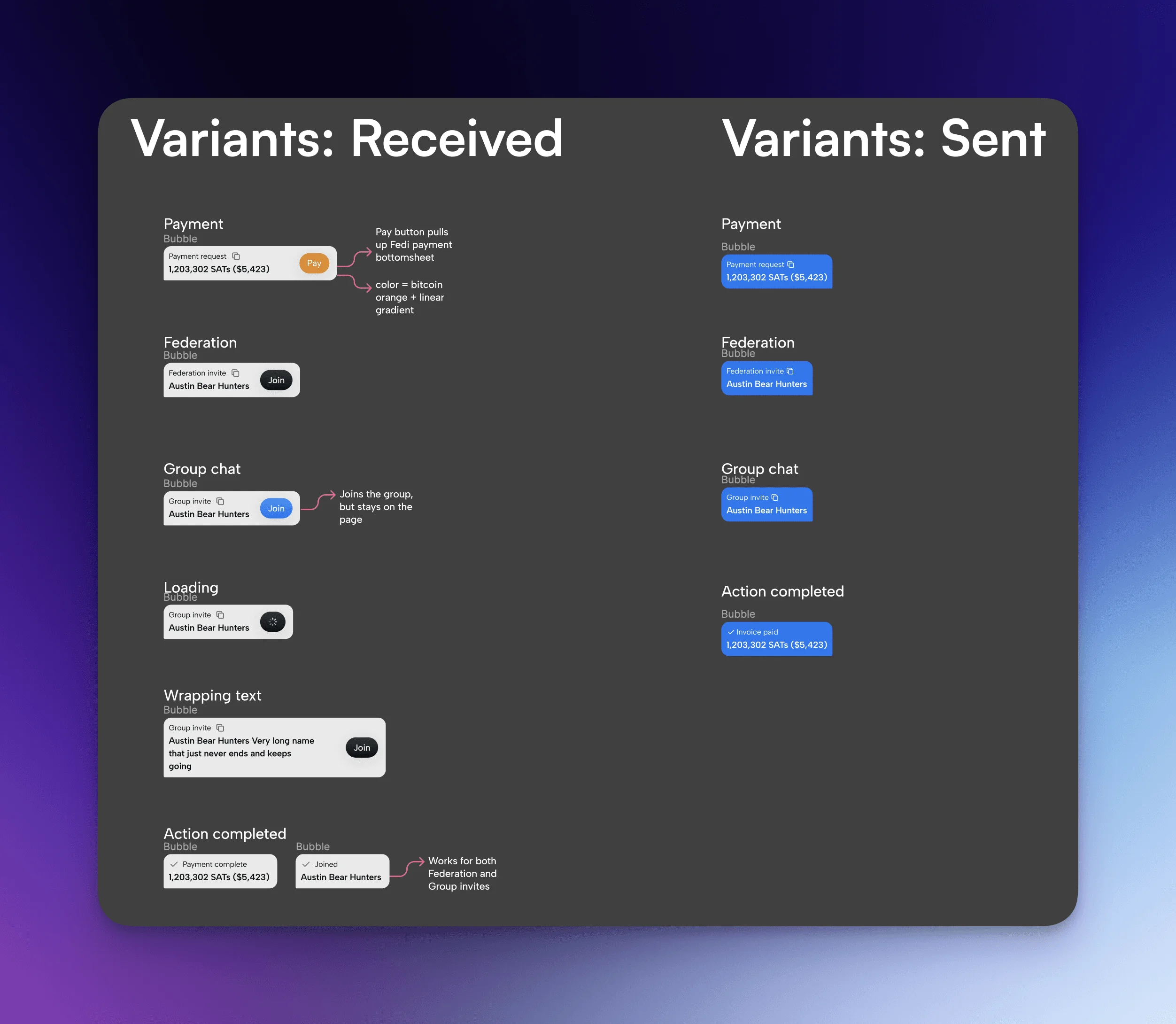
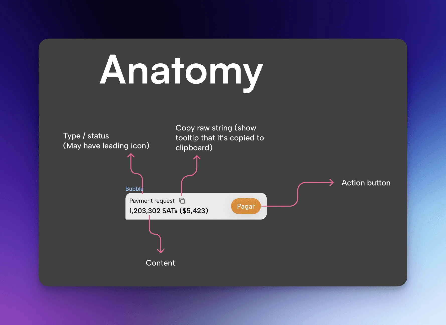
In the design spec, I made sure to include variations of different Dynamic Messages, including both send and receive. I also broke down the anatomy of a Dynamic Message to make it easily digestible for the engineer that picks up this project in the future.